- Home
- Brand guide
The Pool Attendant Company brand guide
The mark, the lockups, the colours, the typeface and the photographs, with the files to download. For anyone who puts our name on something: a partner's newsletter, a press release, a board packet, a uniform order.
Fifteen bars around eight.
The mark is a square of stripes: fifteen vertical bars framing eight horizontal ones, every bar the same weight. Read it as lane lines and a deck, or as the ordered record we keep of every shift. It works at the size of a favicon and on the back of a polo, and it is the only symbol we use.
Clear space and minimum size
Keep a margin of x around the mark on every side, where x is the width of its three-bar frame, about a fifth of the mark. Nothing sits inside that margin: no text, no photo edge, no other logo.
- Minimum size on screen: 24 px. In print: 8 mm. Below that, the bars close up.
- Always square. Never stretched, rotated, outlined, given a shadow or a gradient, or redrawn with a different number of bars.
- Three colours only: pool blue on navy, navy on white or foam, white on pool blue or on a dark photo with enough contrast.
The mark, then the name.
The wordmark is the full name set in Figtree Bold: The Pool Attendant Company, always all four words, never “TPAC” on its own in a logo and never “Co.”. Use the horizontal lockup wherever there is room, the stacked one for square spaces, and the mark alone below 24 px.










Navy first. Blue for action. One warm accent.
Deep End navy is the brand: it is the uniform, the header, the towel stripe and the dark bands on every page. Pool blue is the mark and small accents. Action blue is for buttons and links, nothing else. Deck orange is one warm note, used once on a page at most. Everything else is a neutral.
Printed signage palette
Signs follow the safety-colour conventions people already know, so a red band means closed and yellow means caution. These five live only on printed signs, never in the brand itself.
#0057B8Safety green #00843DCaution yellow #FFD100Warning orange #F47920Danger red #C8102EFigtree, four weights.
Figtree is a friendly geometric sans with an open licence, so every partner can install it. Headings are extra bold and tight; body text is regular with room to breathe. One family means a board packet, a sign and the portal all read as the same company. If Figtree can't load, Helvetica Neue or Arial stand in.
AaFigtree · 400 / 500 / 700 / 800 · Google Fonts, OFL
- 400Body copy, captions, form fields.
- 500Labels, table headers, navigation.
- 700H3, buttons, the wordmark, bold runs in body copy.
- 800H1 and H2, large numbers.
The work, in daylight.
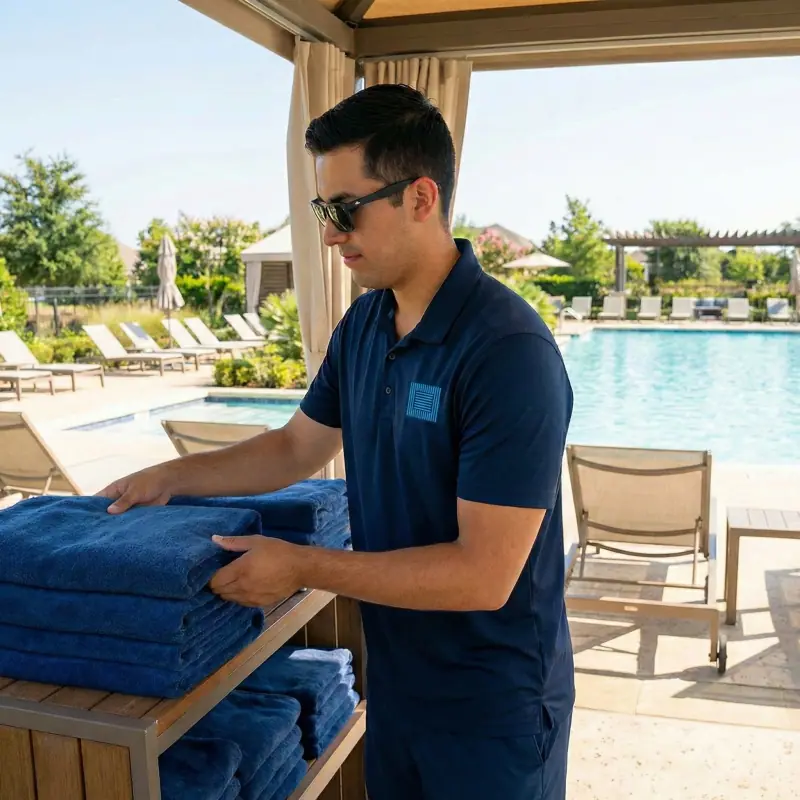
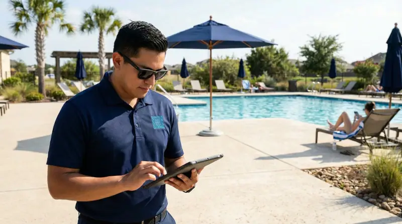
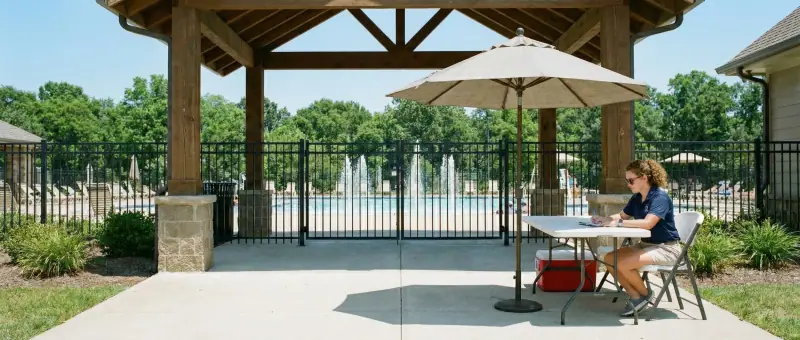
Real attendants in the navy polo, on real community decks, doing the job: the check-in table, the tablet, a round along the fence, towels on the cart. Natural light, honest colour, nobody posing for the camera. No whistles, no lifeguard chairs, no stock smiles.
The kit.
Everything on this page as files. The SVGs carry the font inside them, so the wordmark renders the same in any tool. Partners and printers can take the whole zip.
The mark
Navy, pool blue, white, and pool blue on a navy square. SVG plus 512 and 1024 px PNG.

Horizontal lockups
Mark and wordmark on one line. SVG, 1× and 2× PNG with transparent backgrounds.


Stacked lockups
For square spaces: social avatars, embroidery proofs, the proposal cover.
Colours
CSS custom properties and a JSON file with the names and uses.
Typeface
Figtree by Erik Kennedy, SIL Open Font License. Install it from Google Fonts.
Boilerplate
The Pool Attendant Company staffs HOA, condo and hotel pools with trained pool attendants, monitors and gate guards in Texas, Florida, Georgia, South Carolina, North Carolina and Colorado. Attendants check residents and guests in, apply the posted pool rules, walk the deck on regular rounds and log every incident, so the board has a documented record after every shift.
Need a file that isn't here, or want to check how you're using the brand? Email office@thepoolattendantcompany.com.
Looking for pool attendants, not logos?
Get a free, itemized proposal for your community.